Introduction
The Kava network is a decentralized Layer-1 blockchain combining both the Cosmos and Ethereum chains.
Originally built as a decentralized finance (DeFi) webapp where users could lend, borrow and swap their coins, Kava has quickly grown and evolved to become it’s own blockchain, the Kava Chain. Developers started building on the Kava Chain and new projects like DeFi apps and coins started appearing, creating the Kava Ecosystem.
Details
Timeline
- 2022 - 2023
Tools
- Figma
- UserTesting.com
- Google Sheets
- Typeform
Team
- UI/UX designer
- Lead UX designer
- Front-end developers
- Product Manager
Challenge
As the Kava Ecosystem quickly grew, the barrier of entry and level of complexity for new users grew as well. Existing users still saw Kava as a DeFi tool rather than a blockchain ecosystem. This redesign needed to:
- Reframe Kava’s identity as a Layer-1 blockchain
- Simplify onboarding of new users onto the Kava Ecosystem
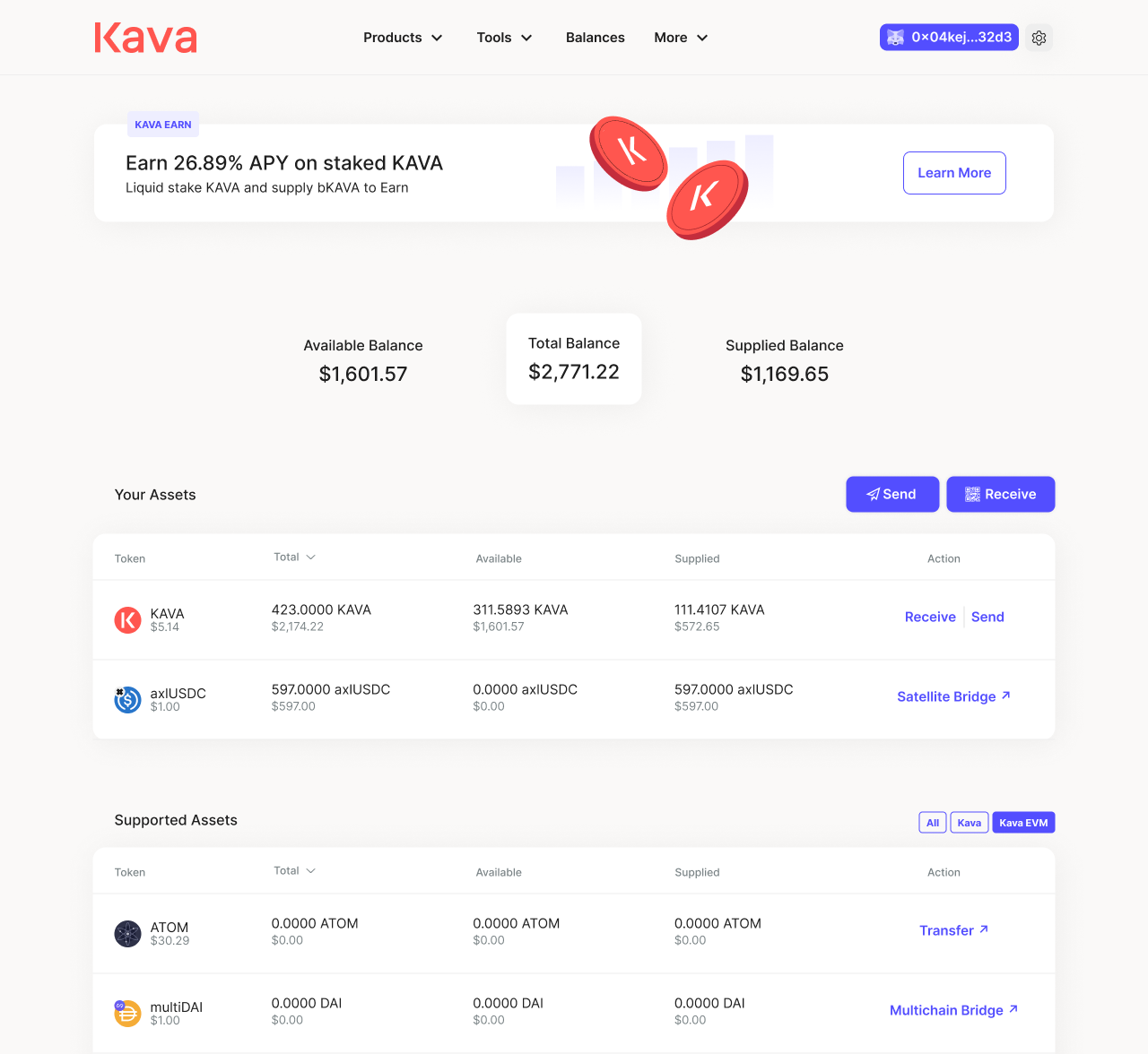 Old user interface
 Research
In order to make an informed and data-driven redesign of the webapp, I first conducted a competitor analysis of similar chains, such as Polygon, Avalanche, Fantom and Ethereum, then surveyed 210 participants to better understand what they valued most in Layer-1 ecosystems.
The primary takeaways are:
- Nearly half of participants only used a single wallet. Not supporting a user’s preferred wallet was a major drop-off point.
- Safety and security was rated as the most important factor (4.83/5) when users choose a chain. They also valued APY/Rewards (or how much they can earn) and ease of use.
- Users trust their peers and influencers. Friend recommendations and Youtube were the top channels for chain discovery.
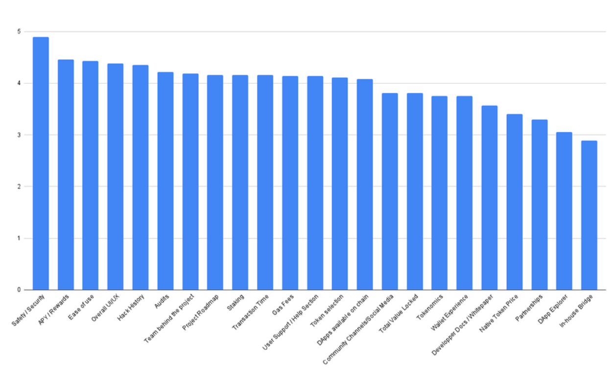 Survey results: Please rank (on a scale of 1 to 5) what aspects are most important to you when considering which chain to use
 Solution
We redesigned the information architecture of the webapp, shifting from showcasing a single product to curating an entire ecosystem. It highlight’s not just Kava’s native lending, but also other dApps (DeFi Apps) in the ecosystem, like Curve and Equilibrium. By showcasing new dApps on the Kava Ecosystem, it helps boost their credibility and sense of safety, therefore encouraging developers to build on Kava.
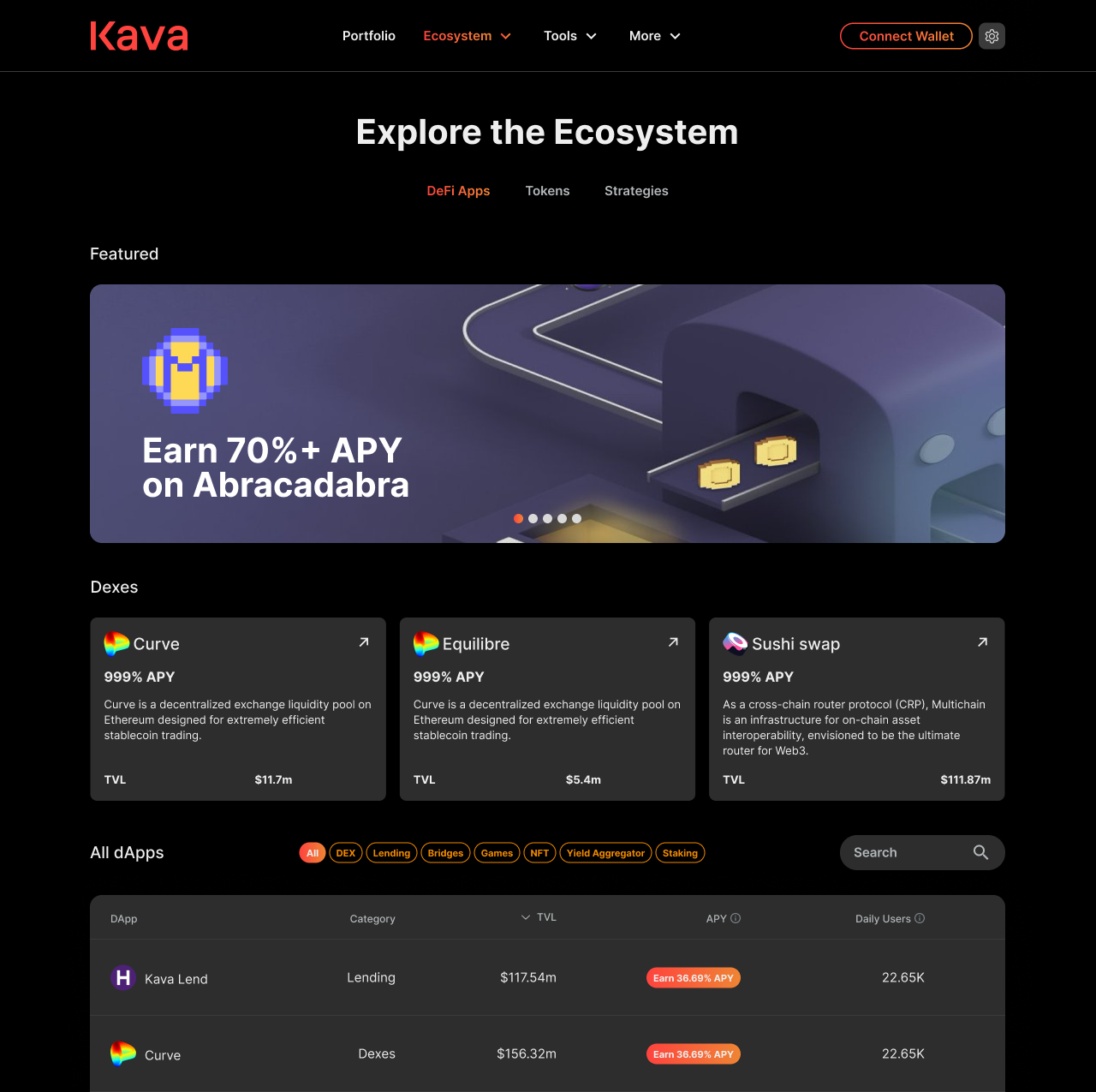 The Ecosystem also includes a section with different earning strategies across Kava, another way of allowing users to discover what the different dApps have to offer.
We also facilitated new user onboarding into the chain by guiding the user step-by-step. Ideally, Kava would support more wallets in the ecosystem, especially Crypto.com Wallet and Coinbase Wallet.
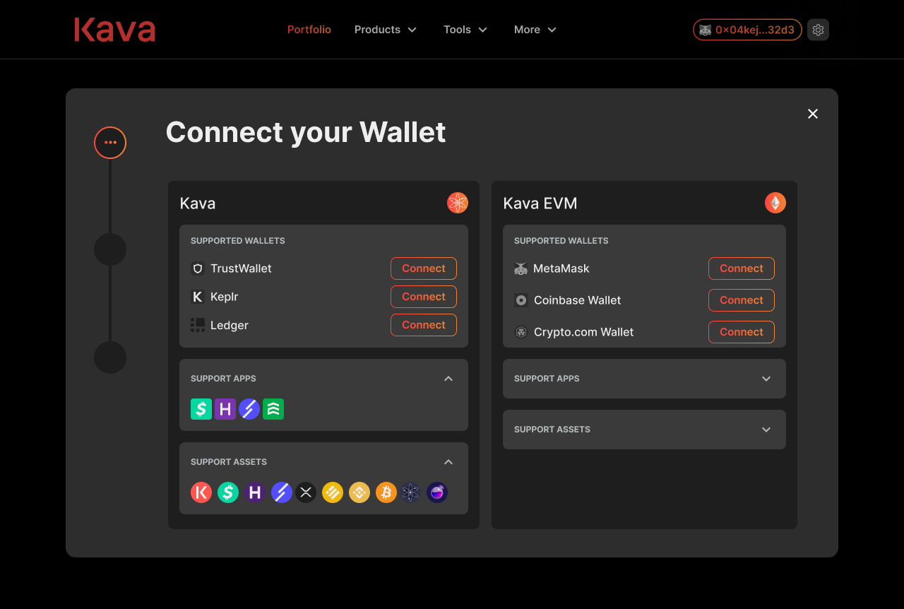 Easier onboarding flow and added wallets
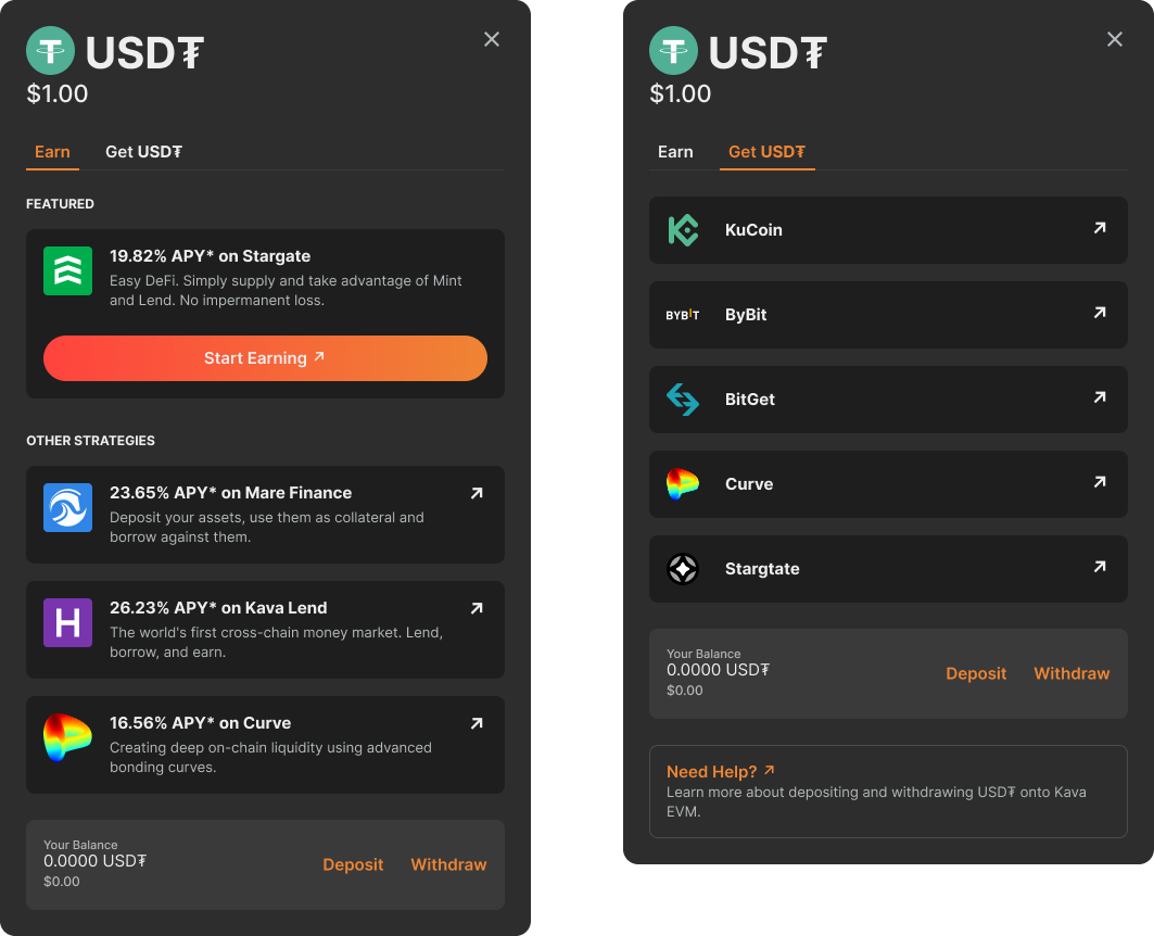 Updated token modals
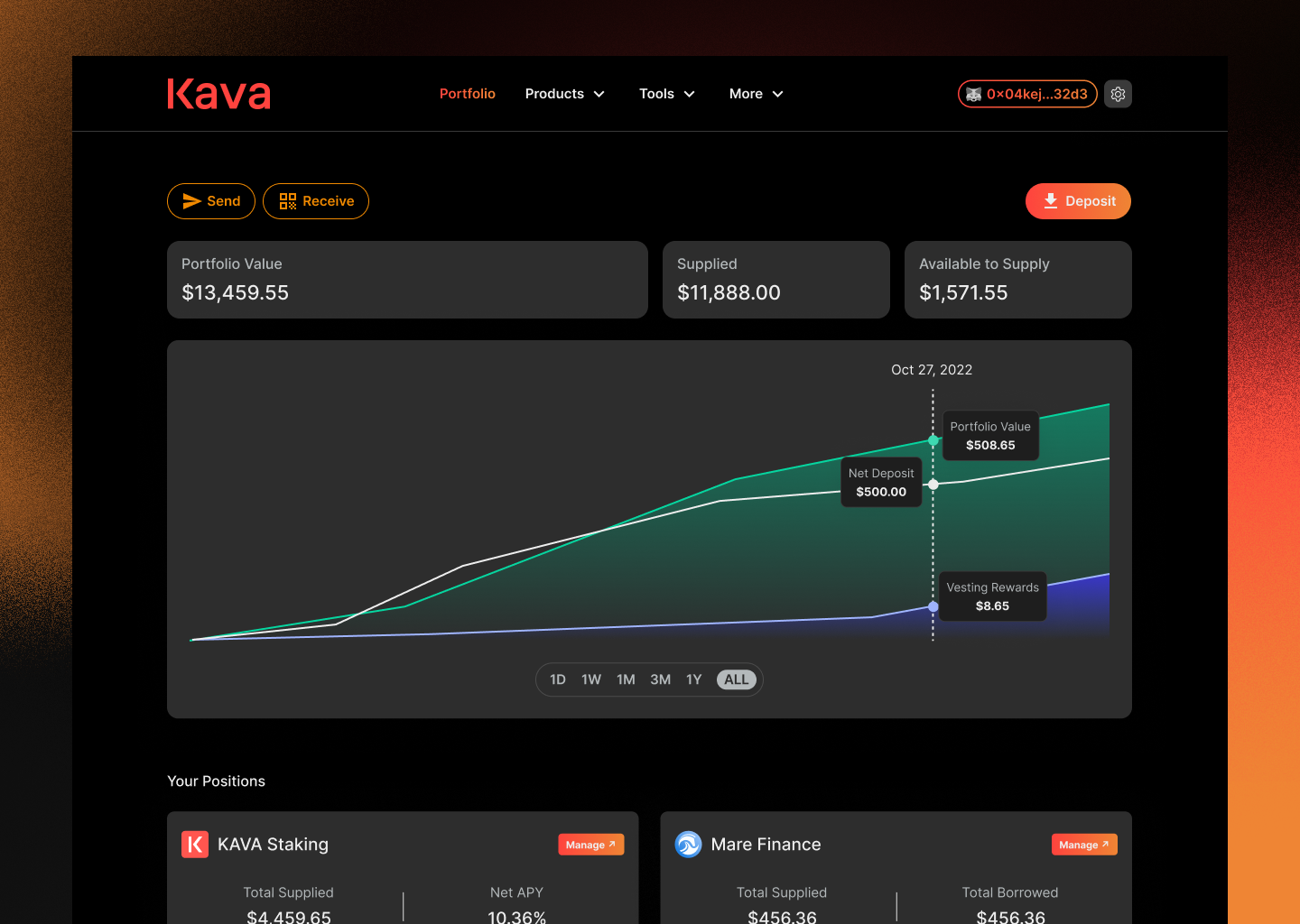
The Balances page was renamed into the Portfolio page, making it easier for users to see and keep track of all their holdings on the chain in a single location.
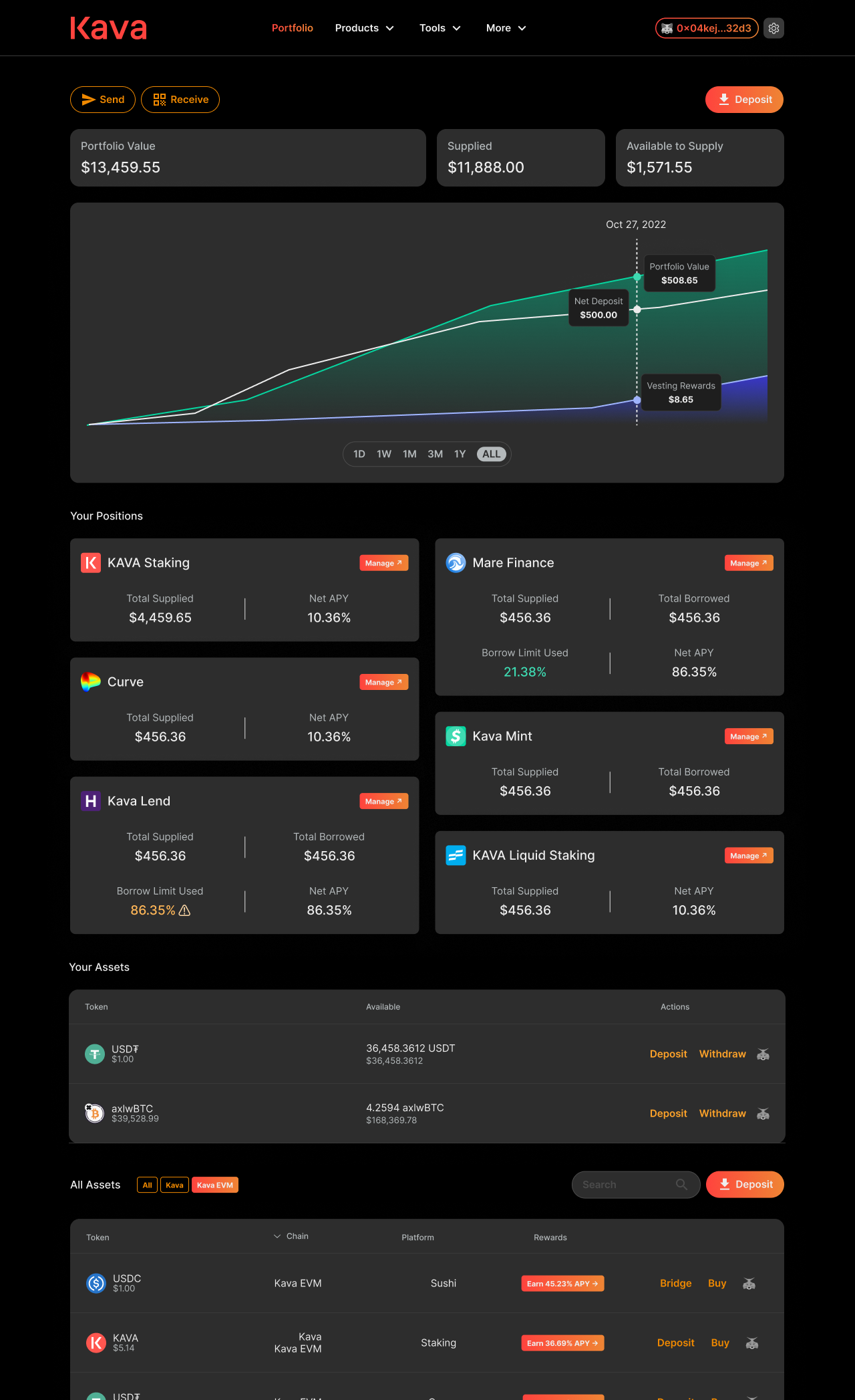 Redesigned portfolio page
 Results
The full redesign I propose here did not end up launching due to shifting company priorities. Additionally, many features required on both the front-end and back-end did not yet exist, and developing them was not a current priority. However, the research uncovered critical insights that informed future wallet integrations and onboarding flows.
If this redesign had been shipped, I would have measured success through the following metrics:
- Onboarding Conversion Rate: % of new visitors who complete onboarding.
- Transaction volume: growth in total number of transactions on the network.
- TVL (Total Value Locked): increase in assets supplied or staked within the ecosystem
- Ecosystem engagement: higher interactions with dApps and cross-chain features surfaced on the new dashboard.